


When Google Merchant Center rejects your branding logo image, it means the logo does not meet specific requirements or quality standards. For example, you might see an error message indicating that your logo isn’t readable on small screens. This happens because on smartphones or tablets, a detailed logo with small text can shrink to a size where its details become too hard to discern, which hurts the user experience. In this guide, we will explain why logos get rejected and how to fix the issues so that even beginners can get their business logo approved in Google Merchant Center.

Google Merchant Center Logo Requirements
Before troubleshooting the rejection, first ensure your logo meets Google’s basic submission criteria. Google has specific guidelines for logo dimensions, format, and quality:
- Aspect Ratio & Size: Logos must be either square (1:1 aspect ratio) or wide rectangle (up to 2:1 aspect ratio). A square logo should be between 500×500 and 2000×2000 pixels, and a rectangular logo should be between 1000×500 and 2000×1000 pixels in size. (For example, a rectangular logo 1000×500 pixels is 2:1. An image that is 999×500 pixels would fall outside the required ratio and be rejected.) Make sure your image’s width and height exactly meet the ratio requirements – no more, no less.
- File Format: Use a high-quality image format such as SVG (preferred), PNG, or WEBP. The SVG format is recommended because it is scalable and retains crispness at any size without compromising quality.
- File Size: The image file must be no larger than 5 MB, and neither dimension should exceed 2000 pixels. Files or resolutions that are extremely large are not accepted.
Ensuring your logo meets these specs is the first step. Now, let’s examine common reasons why an otherwise valid logo might still be rejected and how to address each issue.
Common Reasons Logos Get Rejected (and How to Resolve Them)
Google reviews every uploaded logo. If your logo fails any quality checks, it will be disapproved. Below are the most common rejection reasons and how you can fix them:
Logo text or details are unreadable on small screens:
One of the top reasons for rejection is that the logo doesn’t scale down well. Google will reject a logo if its text becomes illegible when resized for smaller displays. In fact, even if you upload a 500×500 pixel image, it may be displayed at only about 50×50 pixels in certain ad formats. At that size, small text or intricate details will vanish. How to fix it: Simplify your logo for the small-square format. If your logo contains text, ensure the text is large, bold, and high-contrast so it remains clear at reduced sizes. Avoid skinny fonts; use a thicker typeface for better visibility. It’s often best to remove text entirely and use a simple icon or symbol for the Merchant Center logo – for example, use your favicon (the small icon associated with your website) as the logo. Google’s guidelines note that square logos don’t even need to include the brand name. Also avoid having too many little graphical elements – focus on one recognizable image or letter. The goal is a clean, easy-to-recognize logo even at thumbnail size.


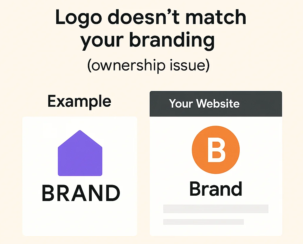
Logo doesn’t match your branding (ownership issue):
Another common issue is when the logo you uploaded appears to belong to someone else, a different brand, or simply does not match your website. Google requires that you own the branding assets you submit. In practice, this means the logo should closely relate to the name or branding on your website. If the logo appears to be from a different company or is drastically different from the one on your site, it will be disapproved. How to fix it: Use a version of your own official logo. The imagery or text in the uploaded logo should correspond to your business name or brand identity. However, it doesn’t need to be an exact copy of your website’s header logo – it’s acceptable (and even advisable) to use a simplified or text-free version in Merchant Center, as long as it remains clearly associated with your brand. For example, you might use just the symbol or icon part of your logo. The key is that a user or Google reviewers can tell the logo represents the same business as your website. All logos must also comply with Google’s shopping ad policies, so avoid any trademark infringements or misleading branding – stick with your own brand elements.

Incorrect aspect ratio or image dimensions:
Google will not accept logos that are not perfectly square or that exceed the rectangular ratio limits. For instance, if you try to upload an image that is not exactly 1:1 or 2:1 in aspect ratio, it will be rejected. A common mistake is having off-size images like 999×500 pixels, which is just shy of 2:1 and thus invalid. How to fix it: Edit or resize your logo image to the correct dimensions. Ensure a square logo’s width and height are identical, and a rectangular logo’s width is exactly twice its height (with no rounding errors). It’s safest to make the dimensions one of the standard sizes (e.g. 500×500, 1000×500, 1500×750, etc.). You can use an image editor to add padding or crop as needed to achieve a perfect ratio (just be careful with adding too much padding – see the note on whitespace below). After resizing, double-check the image properties on your computer to confirm the pixel size. For example, on Windows, you can right-click the file, choose “Properties,” and look under the Details tab for dimensions. On Mac, you can Control-click the file and select “Get Info.” Verify that the numbers match Google’s requirements before re-uploading.


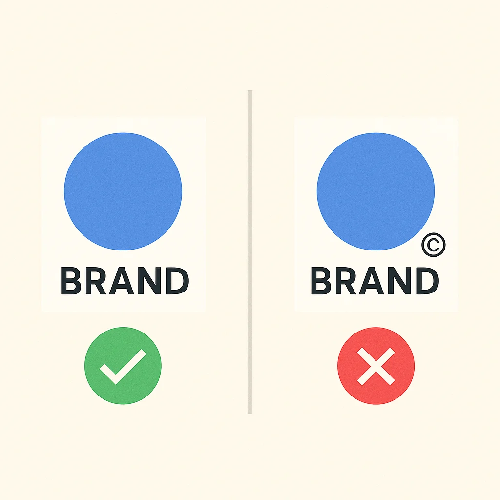
Logo contains a watermark or extra text:
Google does not allow watermarks, copyright marks, or any extraneous text/graphics on the logo image. The logo should be a clean representation of your brand, not an advertisement or protected image. If you overlayed a “©” symbol, trademark (™/®) symbol, or any kind of watermark on your image, it will trigger a rejection. How to fix it: Remove all watermarks and non-essential text from the image. The logo file should contain nothing but your official logo design. As Google’s policy states, you can’t have any watermarks on the uploaded logo. Use the original, unwatermarked artwork. (If you are concerned about intellectual property, rest assured that the logo is only used within your ads; Google isn’t going to misuse it, and watermarks are not permitted in this context.)
Background is not white or transparent (or there is excessive padding):
Google prefers logos with a neutral background. If your logo image has a colored background or a lot of empty space around the design, it might be flagged. The ideal logo has a transparent background (preferred for most logos) or a plain white background. This ensures the logo sits cleanly on any interface. To fix it, ensure the background of your logo file is clear or white, with no distracting colors or patterns. If your logo is a colored shape or text, export it in PNG or SVG format with a transparent background, if possible. Also, avoid adding unnecessary whitespace (padding) around the logo to meet size requirements. For example, do not place a small logo in a large white square just to reach 500×500 pixels – Google considers that “negative space” padding and may reject it. Instead, resize or rearrange the logo so that it naturally fills most of the frame. The main graphic should take up the majority of the image area. By cropping tightly and using transparency, you ensure the logo is centered and clearly visible without any wasted space.

Where To Add or Edit Your Branding Logo
To edit or add your branding logo, go to Google Merchant Center > Settings > Business Info > Edit logos and colors, or click here: https://merchants.google.com/mc/branding


Conclusion:
In summary, double-check each of the above aspects if your Google Merchant Center logo was rejected. Often, a simple tweak, such as increasing the text size, using just your icon, or adjusting the canvas size, can turn a rejected logo into an approved one.
Reference: https://support.google.com/merchants/answer/15098801?hl=en